Layout History
Here I will be documenting my previous layouts! Each section is the name of the CSS file that the homepage used.

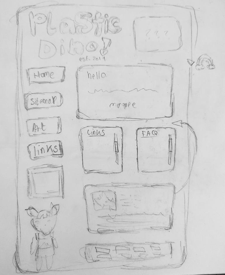
 plasticdino
Here I will be documenting my previous layouts! Each section is the name of the CSS file that the homepage used.
No images of the homepage available. You're not missing much though, it was just a list of my interests on a light blue background. However, It had the rainbow header that I still use. Courier was my favourite font at the time so ofc I used it.
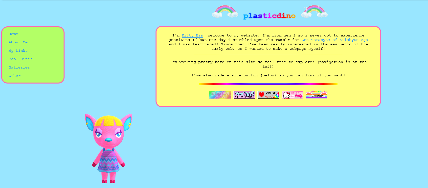
Created in my IT class while I was meant to be doing work :// The college computers blocked neocities and I didn't get how real code editors worked so I just made the entire thing in the w3schools one.
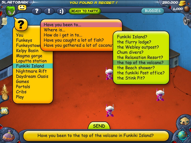
You can still see it on the abandoned log page and it's not the worst thing in the world. The rounded corners and colours were inspired by sites I liked to visit when I was really young, like the Cbeebies website and U.B Funkeys. This is the first appearance of Fuchsia (the animal crossing character hanging out at the bottom of this page) and she will mostly stick around from now on.
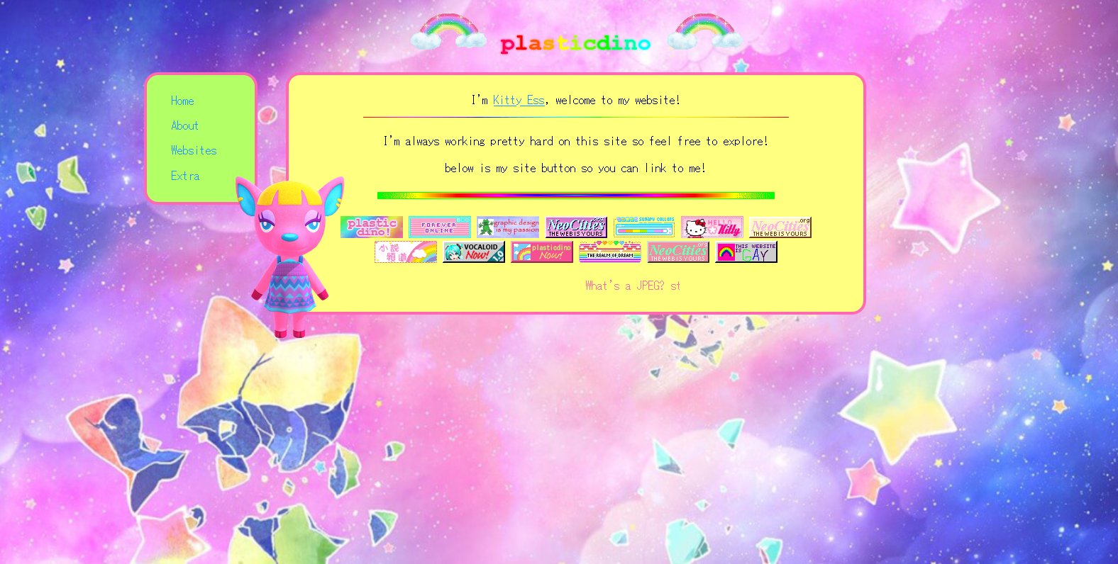
Here the main goal was to try to fix the sidebar. Unfortunately, Fuchsia blocks the sidebar if you look at it on a smaller resolution 😐. The other main change is there's a nice pastel galaxy background now. Plus, the font is MS Gothic. I love this font however it is probably overused on neocities. I still use it as my default font tho. So.
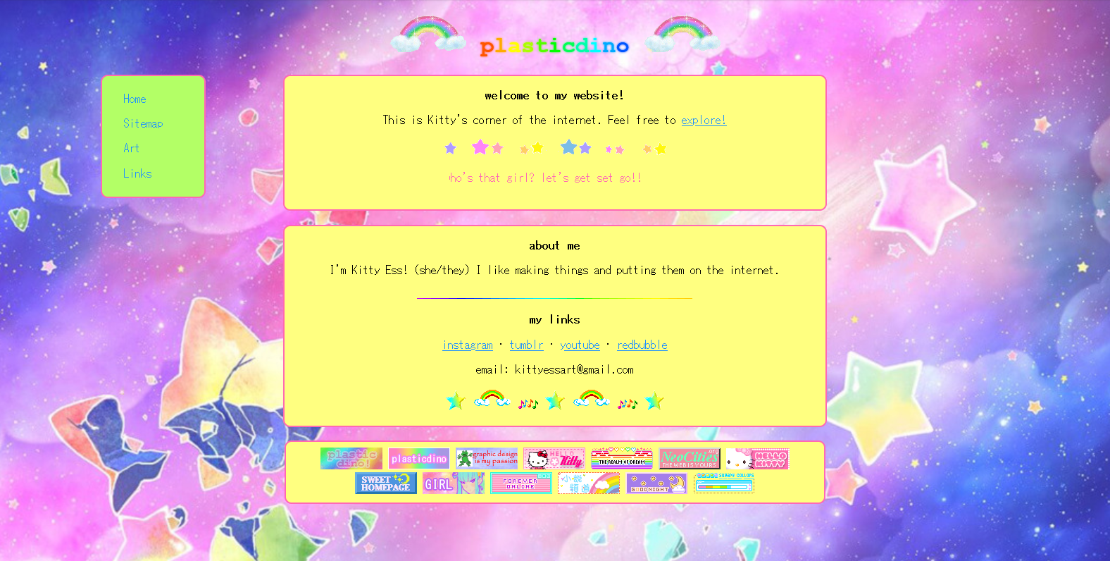
I've skipped over the fourth style because it is extremely similar to third style. This is also quite similar, but there a now more boxes! I think it does look better but I had to take Fuchsia out, cause I didn't know where to put her.
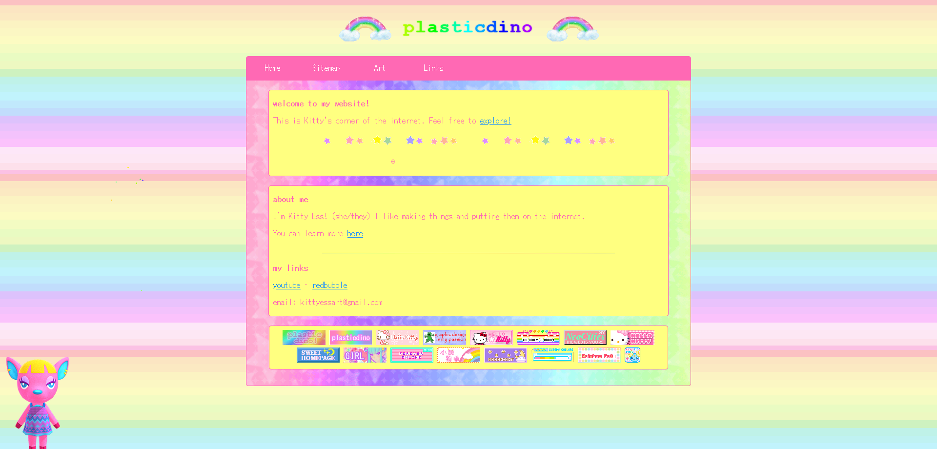
Quite basic looking back on it, but I'm very attached to this one. You can see it here.
My current layout!! (no pic cause... you're looking at it rn). I decided to stop naming the CSS files after numbers cause it's confusing and I don't like numbers. Instead they are now named after whatever song I happen to be listening to at the time I started working on it. In this case, this song.
When I was making this I got really into Japanese web design, especially for things like toys and kids shows. I love the colour schemes, all the banners, and how it seems like an information overload. I wanted to emulate that, but still try and keep the essence of the previous one. Although, I had to bring an end to the hot pink text and highlighter yellow background combination. This is because I finally realised it was an accessibility nightmare. There is still room for improvement, but for now, I love it.
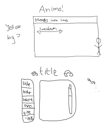
Normally I plan my layouts badly in MS Paint, but I drew my current layout in my school sketchbook. The plan was specifically based on this aikastu layout.